How To Choose Brand Colors That Convert
Color isn’t decoration — it’s a signal. How to choose a brand palette that feels right and actually converts.
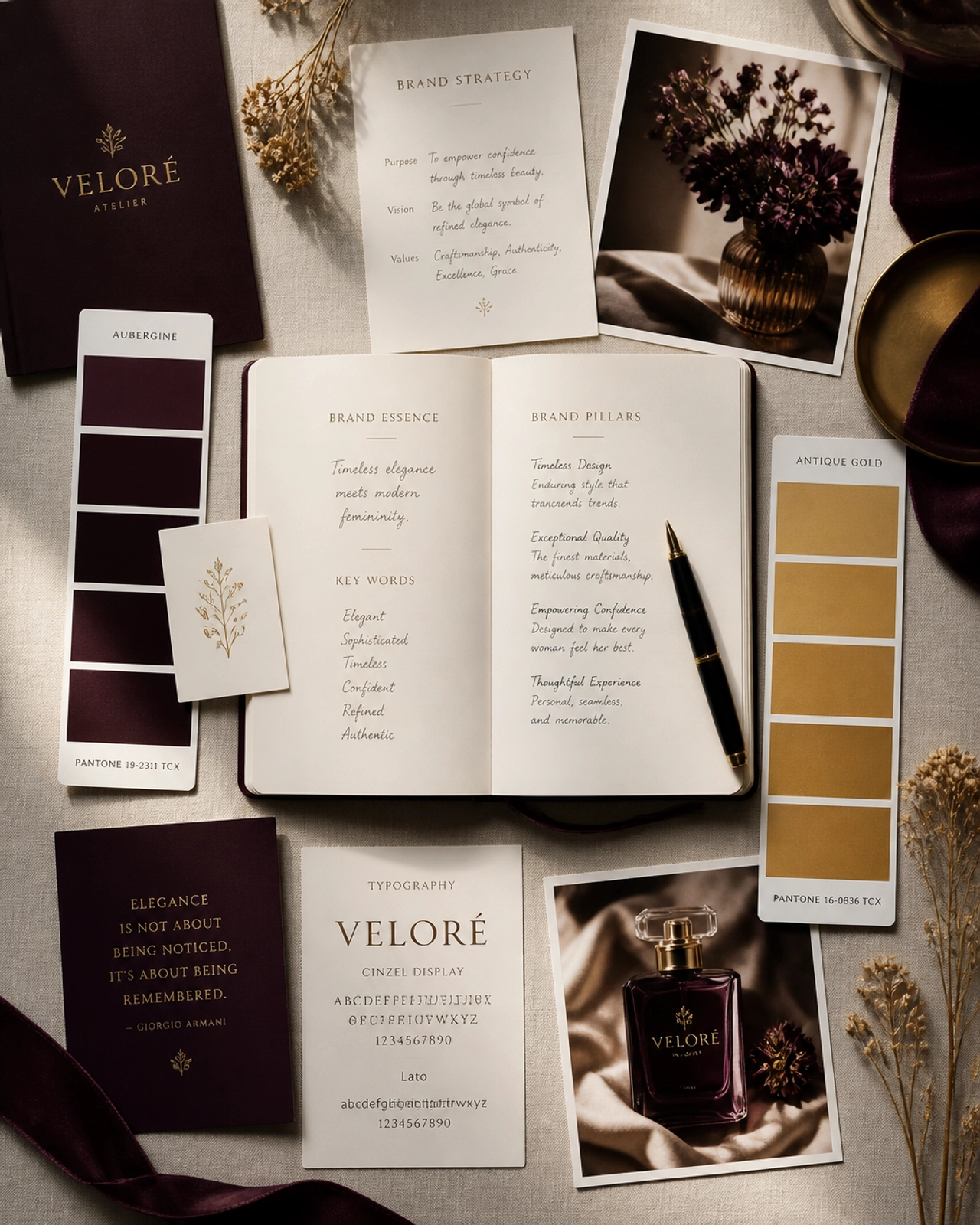
Color is the fastest signal your brand sends. Before a visitor reads a word, your palette has already told them how to feel — premium or budget, calm or loud, trustworthy or forgettable. Choosing brand colors isn't about picking what you like; it's about engineering a feeling and guiding attention. Here's how to do it strategically.
Start with feeling, not favorites
Ask what your brand should make people feel and what your positioning demands. A calm, premium service brand and a high-energy fitness brand need very different palettes. Choose colors that express your point of view, not just your personal taste.
Build a small, intentional system
Most strong brands run on very few colors: a dominant hue, one or two supporting neutrals, and a single accent reserved for calls-to-action. Restraint reads as premium; a rainbow reads as unsure. The discipline is in what you leave out.
Make it legible and accessible
A palette that fails contrast fails everyone — including conversions. Ensure text is readable and your accent stands out where it matters. Accessibility isn't a constraint on beauty; it's part of a system that actually works across web, print, and social.
Your palette is talking before you are. Make sure it's saying "premium," not "unsure."
Lock it into your guidelines
Colors only build recognition if they're used consistently everywhere. Document exact values and usage rules so every human and AI tool stays on-brand — the job of brand guidelines for the AI age. Want a palette engineered for your positioning? That's part of brand strategy & positioning.
Request a Strategy Conversation and we'll map the fastest path from where your brand is now to where it needs to be.
Frequently asked questions
How do I choose brand colors?
Start with the feeling and positioning you want to convey, then choose a small, intentional palette — a dominant color, a supporting neutral, and one accent — that expresses it. Test for contrast and accessibility, and confirm the colors work across web, print, and social before committing.
Do brand colors really affect conversion?
Indirectly but meaningfully. Color sets mood, aids recognition, and guides attention — a well-placed accent on a call-to-action can lift clicks. What converts is not a magic color but a consistent, legible, on-brand system that makes the next step obvious.
How many colors should a brand have?
Fewer than you think. A dominant color, one or two supporting neutrals, and a single accent for calls-to-action is enough for most brands. Restraint reads as premium and keeps your identity recognizable; too many colors dilute it.
Let’s turn this into results for your brand.
We build brands backwards — strategy and buyer psychology first — so your brand doesn’t just look good, it works hard and generates revenue.